I like it, the background's anti-aliased-but-2d look gives an impressionistic feel and the sharp tones of the flowers make it pop out of the background. Here's the thing, I'm not your target audience, you should field this to women you know, and preferably let them play test. I cannot stress that enough.
I think your color choices are good and the bold lines give everything a clear, appealing look.
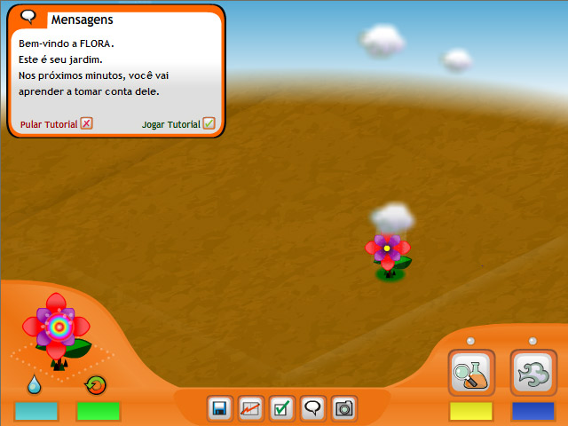
I find it a bit off that every icon has a bounding box except the water droplet and the... what is it, a recycling logo?
There's something a bit out of place about the graph icon as well. It feels... awkward to me. For whatever reason, I think it' be better to have a bar chart icon instead.
Patrick and Chris: I´ll try to show it to the potential 'target audience'. I´m glad you think the flower is evident due to the anti-alias background - that´s what I was aiming for.
Corvus: The Water droplet and the cycle logo (which indicates the life cicle) are not buttons - that´s wjy they lack the bounding box.
You might have a point. After reading your comment I couldn´t avoid thinking that the graph icon looks like a medical graph. I might re-work this one, if I have the time.
4 comments:
I like it, the background's anti-aliased-but-2d look gives an impressionistic feel and the sharp tones of the flowers make it pop out of the background. Here's the thing, I'm not your target audience, you should field this to women you know, and preferably let them play test. I cannot stress that enough.
I think your color choices are good and the bold lines give everything a clear, appealing look.
I find it a bit off that every icon has a bounding box except the water droplet and the... what is it, a recycling logo?
There's something a bit out of place about the graph icon as well. It feels... awkward to me. For whatever reason, I think it' be better to have a bar chart icon instead.
Again, overall I like what you're going for!
Looks good to me! But as Patrick says, I'm not necessarily your target audience. :)
Thank you all for the input!
Patrick and Chris: I´ll try to show it to the potential 'target audience'. I´m glad you think the flower is evident due to the anti-alias background - that´s what I was aiming for.
Corvus: The Water droplet and the cycle logo (which indicates the life cicle) are not buttons - that´s wjy they lack the bounding box.
You might have a point. After reading your comment I couldn´t avoid thinking that the graph icon looks like a medical graph. I might re-work this one, if I have the time.
Again, thank you all for your cooperation.
Post a Comment